Fleetwood designer Patricia Wakely on the paint shades she predicts will be popular in the year ahead
As we move into 2025, a shift towards warmer, earthy tones in interiors is emerging. This trend reflects a desire for comfort, nostalgia, and grounding in the home. At Fleetwood, we’re seeing a renewed interest in colours that evoke a sense of familiarity and warmth, while also embracing the sophistication of deep, moody hues. Here’s what we predict for the year ahead, and how you can use these on-trend colours in your home.
A Revival of Warm Earth Tones
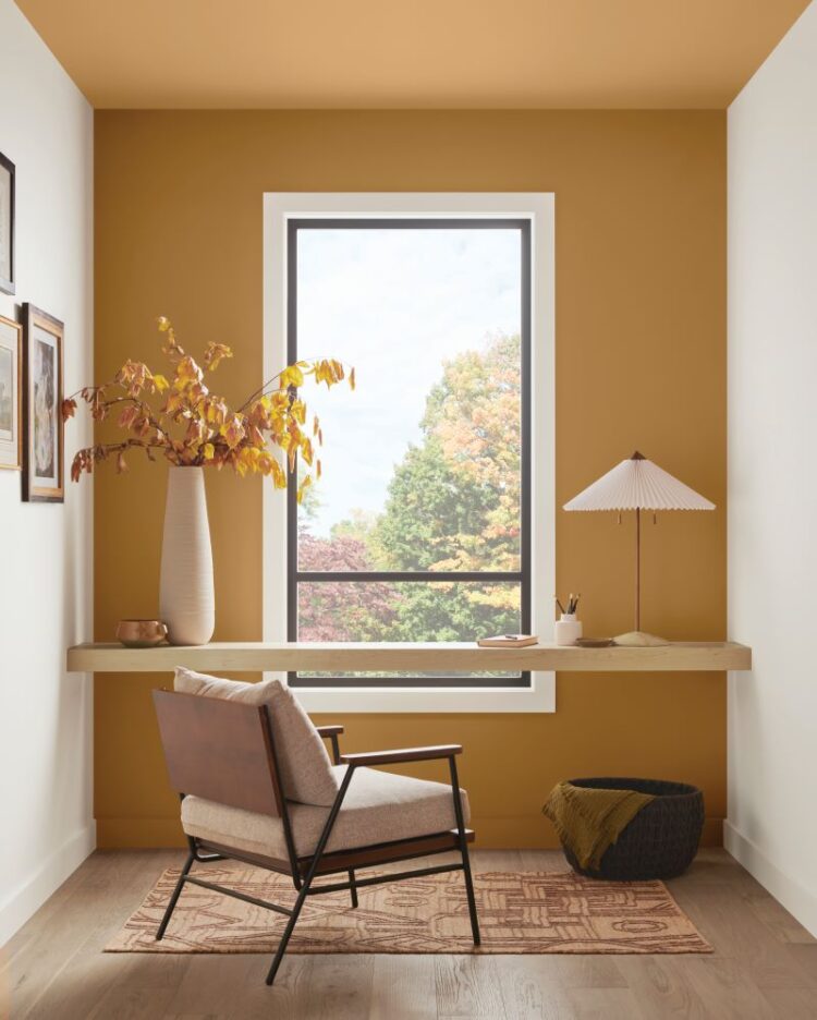
One of the standout colours in our 2025 palette is Indian Buff CP1256. This stunning, soft, aged-gold shade captures a sense of nostalgia and joy, making it a perfect choice for spaces where warmth and comfort are key. Without the sharpness of lime or overly bold yellows, Indian Buff feels mature, confident, and inviting. It’s the kind of shade that naturally creates an atmosphere of joy, while still being subtle enough to evoke a sense of calm. This colour works particularly well in kitchens and living spaces, areas that are often at the heart of the home.
To balance the warmth, pairing Indian Buff with deeper neutrals like Caravel Batik adds depth and sophistication. While traditional off-whites like Dusty White have their place, these more substantial neutrals create a sense of grounding and bring a refined edge to the room. The rich contrast between the warm gold and the deeper neutral enhances the overall palette, providing a dynamic backdrop for everyday life.
The Rise of Moody Interiors
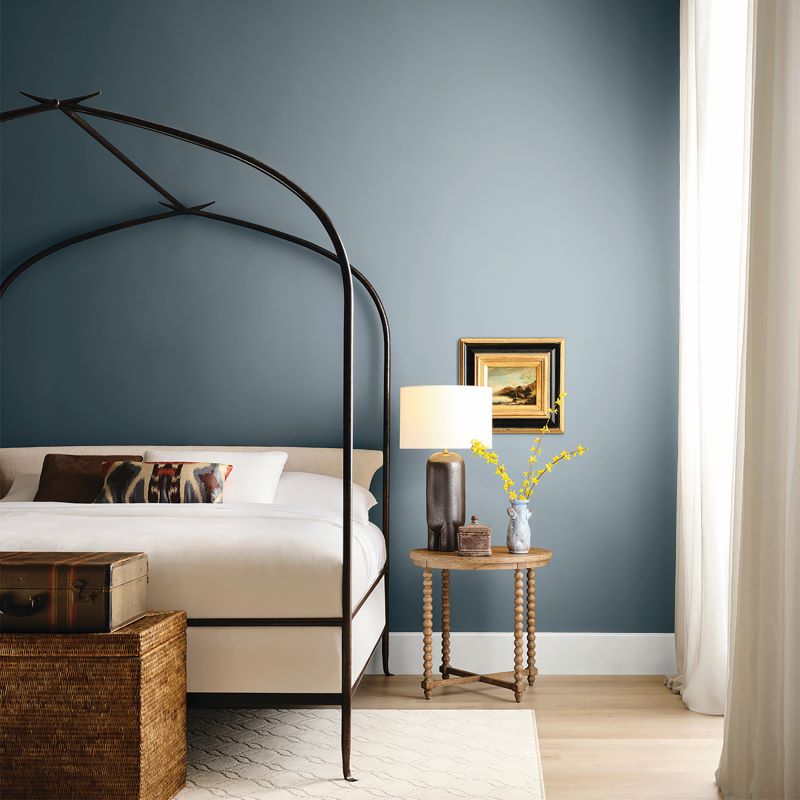
For those who want to embrace a more dramatic aesthetic, 2025 is all about leaning into deep, enveloping shades. One of our favourites is Designer Blush, a rich, earthy brick tone from our Popular card, which brings a modern twist to traditional warm hues. This colour has the ability to transform a space, especially when used in a colour-drenching technique, where the same hue is applied across walls, ceilings, and woodwork for a cocooning effect.
Designer Blush works particularly well in dining rooms, living spaces, or even hallways, where creating a strong visual impact is desired. It has a beautifully social quality, making rooms feel inviting and intimate, perfect for entertaining or relaxing.
What makes these deep tones so versatile is how they shift depending on the light. In north or east-facing rooms, colours like Designer Blush or Caravel Batik take on a moodier, more atmospheric feel. In contrast, when placed in south or west-facing rooms, the underlying warmth of these shades emerges more prominently, giving the room a sun-drenched glow that feels both elegant and grounded.
Balancing Depth with Neutrals and Texture
To ensure these deeper tones don’t feel overwhelming, it’s important to balance them with thoughtful design choices. Consider introducing natural textures, like wooden furniture, woven fabrics, or even stone elements, to add visual interest and keep the space from feeling too dark. Accessories in gold or bronze can elevate the earthy feel and add a touch of glamour, while soft lighting will help highlight the warmth in these tones, particularly in the evening.
For homeowners who love the idea of bold colours but want to ease into the trend, these shades work beautifully as accent walls or in smaller, more intimate spaces like reading nooks, powder rooms, or even entryways
In 2025, it’s all about embracing colour that evokes a sense of warmth, connection, and timeless style. With Fleetwood Paints, you can be sure that each colour is crafted to not only make a statement, but also enhance the natural beauty of your home, bringing depth and warmth to every room.
To celebrate the festive season, Fleetwood is giving away €500 of paint to one lucky reader! To win, simply fill in the form below. Best of luck!


