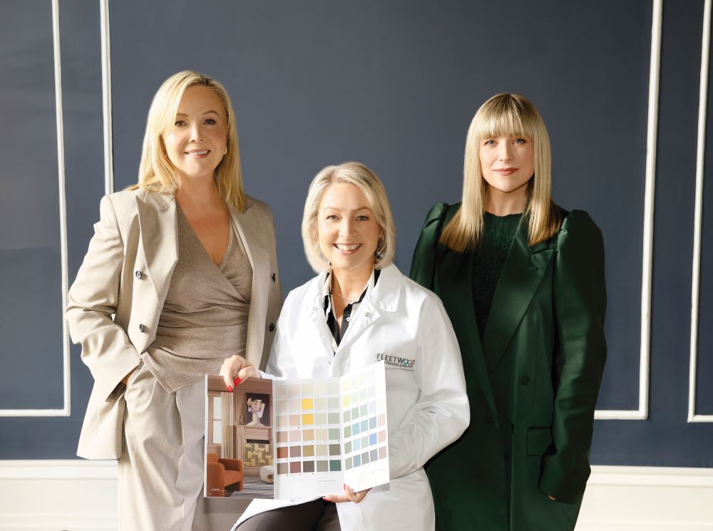
Internationally renowned interior designers – and collaborators on the Prestige range by Fleetwood Paints – Arlene McIntyre and Róisín Lafferty, share their 2026 predictions
What are your colour predictions for the year ahead?
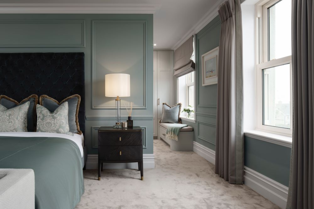
Róisín: I think we’re moving into a phase where people want colours with real honesty and depth. Shades that feel rooted in nature, a little softened, a little atmospheric. Those earthy midtones with a gentle, timeworn quality are becoming so important because they make spaces feel comforting, calm and lived-in straight away. Within my Prestige collection, shades like Ceppo, Vincenzo and Dedar offer that soft, understated depth that shifts beautifully with changing light, tones people instinctively gravitate toward. Earthy greens such as Necchi or Sea Foam bring a grounded richness to a room, while deeper hues like Zallal or Fitzwilliam Square create a wonderfully cocooning atmosphere. For something lighter and more serene, muted blues like Vartry and Malin have a timeless, calming quality.
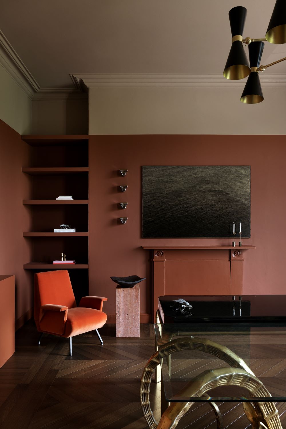
Arlene: When I look ahead to 2026, I see four clear colour directions emerging in interiors, and shades from my Prestige by Fleetwood collection align beautifully with each. First, I believe we will see deeper, mood-making tones finding their place again. In this direction I’m drawn to Mulled Wine, a rich, wine-toned red from my collection. It brings intimacy and elegance, perfect for a dining room or a lounge where one wishes to create warmth. Second, there’s a move toward serene, atmospheric blues and greens. For that I choose Island, a tranquil blue-green with a softly distinctive character, and Olive, a green that works as a sophisticated neutral. These colours work beautifully on cabinetry, feature walls or smaller intimate rooms where calm is the intent. Third, grounded neutrals with depth will continue to dominate. Here, Sisal is a warm neutral that offers a gentle structure to a space, and Gris Mouette, is a subtle grey-toned neutral that holds its own in both modern and classic interiors. Finally, accent or tonal colours with personality still have a role, but they’re being used with purpose rather than as fleeting trends. The shade Star Anise is a thoughtful example; it offers a deep, almost inky dusky tone, and can be used sparingly or in detail for real impact.
Are there any interior design styles you see people embracing next year?
Róisín: There is a growing focus on the textural tactility of spaces. It is no longer enough for something to simply look good, it has to feel good on every sensory level. The emphasis is now on creating genuine atmospheres with depth and true consideration. Material honesty is at the forefront, with far less interest in picture-perfect finishes. Think low-aging patinas, softened natural textures and pieces that can stand the test of time. These are the elements that bring warmth, soul and a sense of story to a home.
Arlene: One style that continues to grow is what I call soft luxury. It’s not about formality; it’s about quiet elegance. Think clean lines, gentle curves, layered textures and colours that feel soothing, like the soft neutrals and atmospheric tones found across the Prestige by Fleetwood collection. I’m also seeing a renewed appreciation for nature-led design. People are gravitating toward organic materials, botanical greens, and earthy hues. It’s a style that grounds a space and brings a sense of ease, for example Lagoon in a bedroom. Another direction gaining momentum is warm modernism. It blends contemporary simplicity with warmth, combining natural wood, sculptural lighting, and thoughtful colour placement.
What’s your best advice for balancing trends with timelessness?
Róisín: Focus on the colours and materials that genuinely resonate with you. When a shade makes you feel grounded or uplifted, it becomes timeless by default. Try not to be swayed by fleeting trends unless something truly speaks to you. The most interesting homes are built slowly, layer by layer. Collect pieces with sentiment: something passed down through family, discovered on your travels or created by an Irish designer or artist whose work you connect with. These are the elements that bring real soul to a space. A helpful way to think about it is to approach your home the way you would your wardrobe. New collections appear every season, yet we instinctively know which pieces will complement what we already love. Interiors should be the same. Select what feels authentic to you and allow your palette and your objects to evolve with meaning. When your choices are intentional, your home will always stand the test of time.
Arlene: I always advise clients to keep their foundation pieces timeles: flooring, architectural detailing, and the larger furniture items. These anchor a space for years to come. Then you can layer in trend-led elements through colour, textiles, lighting or accessories, which are far easier to evolve over time. When it comes to colour, I suggest choosing shades that feel calm and natural as the backdrop and then using bolder, more expressive colours in smaller, intentional ways. This allows a room to feel both current and considered without ever feeling overwhelming. Another piece of advice is to focus on texture and quality rather than novelty. A beautifully-made piece in a classic material will always outlast something that’s purely trend-driven. Ultimately, timelessness isn’t about avoiding trends, it’s about using them thoughtfully. If you choose colours and pieces that you genuinely love, they will always feel relevant in your home.
For more details on Fleetwood and the Prestige collection, click here.