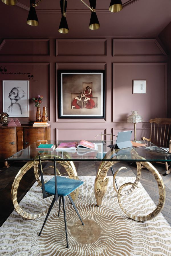
Róisín Lafferty is the Founder and Creative Director of Kingston Lafferty Design. Here, she shares how she created an office that is as vibrant and playful as her business
Photography by Ruth Maria Murphy
Róisín, your work space is the office of dreams. Tell us your vision in creating it?
Thank you! I firmly believe you must practice what you preach. I tell all my clients that the most important thing in interior design is to evoke an atmosphere and chosen mood in their environments. Spaces don’t have to be standard and as expected, our office is no different. I wanted our clients and team to immediately feel and understand the essence of Kingston Lafferty Design (KLD) when they come inside, to see that an office doesn’t have to be corporate and cookie cutter, that the atmosphere can be evocative, enriching, professional whilst still being personal and nostalgic.
Our HQ is a culmination of our ever-evolving collections, work, prototypes and samples. It is a changeable, living space that wraps itself around you as soon as you enter. There is a sense of Narnia within.
What are you most drawn to when designing a space?
The space itself, the theatre of layout, the opportunity to create a physical journey that people interact with. How rooms work together, connect and interact alters our behaviour, our perspective and our outlook. That is powerful. A well-designed space can instil a feeling of calmness, excitement and harmony in those that use it. Mostly this is subconscious, not everyone realises the impact the spaces they live and work in have on their psyche, but it is huge. There is so much room to think about space differently and to excite and delight clients with unexpected plans.
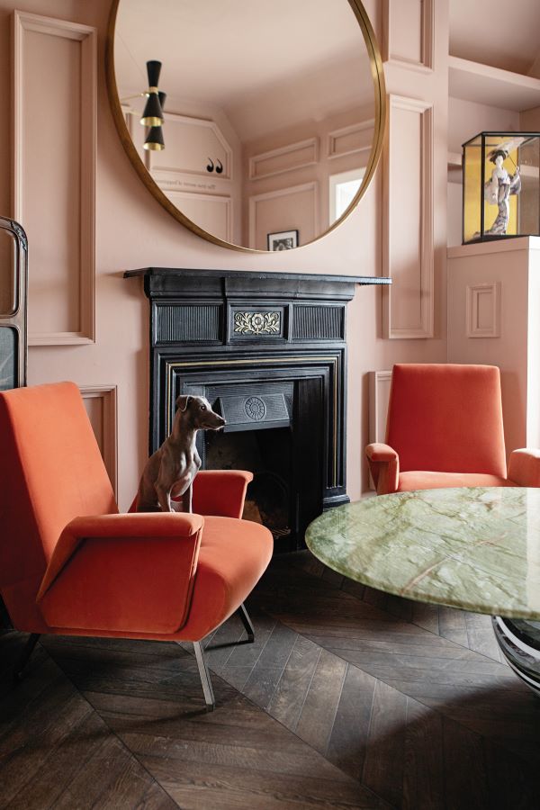
Kingston Lafferty Design likes to bring “a sense of theatre and drama” to clients’ homes. Where does the inspiration for these designs come from?
I have always been drawn to installation art, art galleries, theatre and exploration. I am drawn to a sense of discovery and magic, and evoking a sense of excitement and unexpected delight in people. To me design should be fun, experimental and innovative. Taking inspiration from more abstract things like installation art, breaks down any preconceived ideas and boundaries of home and allows us to open up our clients’ minds to the endless possibilities. As well as loving their homes, we want our clients to actively feel excited and enriched by them on a daily basis.
Let’s talk colour. You used Fleetwood paint; tell us about the shades you went for?
I genuinely love the quality of the Fleetwood Prestige range. It is very luxe and has a deliciously rich and matte feel on the walls which creates a gorgeous atmosphere. We wanted to create a sense of drama and nostalgia throughout our space to echo the history, charm and character of the building. So, all of the tones are quite cloudy and faded, old fashioned almost.
‘Burlwood’ and ‘Mahogany Rose’ are two complimentary dusty shades that feel like putting on rose-tinted glasses; you can’t help but feel positive with them wrapping fully around you. It creates a calm haze. Our studio is brighter but still faded with a soft green grey on walls; ‘Monet’ is understated yet energising. We went richer in the dark stairwells and corridors highlighting the moodiness of the spaces with ‘Dark Navy’.
As a Fleetwood Brand Ambassador, what are other paint shades you recommend?
I designed a lot of the Vogue collection for Fleetwood based on a year of whimsical adventure that Becky [Russell, CEO] and I shared, with lots of travel and inspiration trips. So, I may be biased but some of those are my favourite. Such as: ‘Bofin Fern’ (based on my love of Inishbofin); ‘Rivington Rain’ (the muted navy that a rainy weekend in New York’s Rivington Street brought to mind); ‘Betsy Pink’ (based on the Art Deco Betsy Hotel in Miami I got to explore); and ‘Burnt Sage’ (my favourite ice cream flavour from that New York trip) to name a few. For me, the quality of the Prestige range is like applying a luxurious cream to the walls, it bounces light beautifully, requires minimal coats, is easy to touch up after and is consistently good quality.
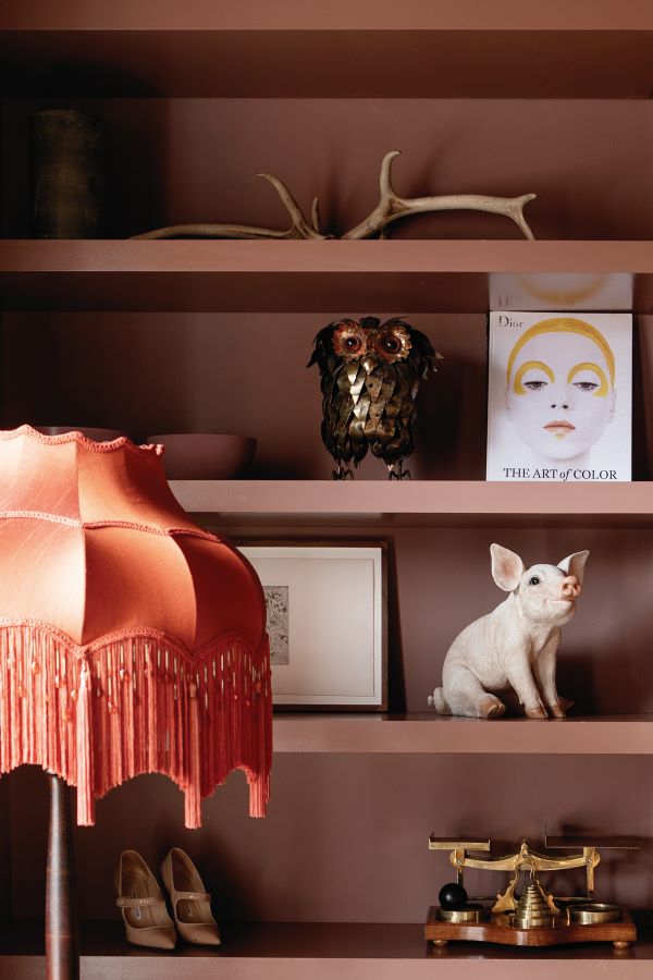
What advice do you have for people on choosing the right colours for them?
Colour is the most transformative tool in decoration and design, aside from the actual layout. I would encourage people to really open their eyes and take in the colours around them, especially the abundance of colours in nature. People often shy away from tone and think about colour in a binary way, but there are millions of tonnes of green in any one park or garden, for example, and they can all work together, too. Doing this before stepping foot into a paint shop will help you have clarity in what can often be an overwhelming setting.
Colours are personal and subjective, trust what you are drawn to for the overall colour, but look at lots of different tones before making any decisions. What looks good on a sample card can be totally wrong in your space. Samples are crucial within your spaces, take time to look at them at different stages of the day. How do they make you feel? Think of your rooms as full spaces, not just walls and ceilings.
How about décor; where do you like to shop?
Our main goal is to design spaces that are unique and different to each other, so diversity of products, furniture and lighting is key. Based on that, we tend to source from all over the world, incorporating new brands in every project. There are some shops that we work with frequently because they supply brands from all over: Minima, Lost Weekend, Nordic Elements and Ecru Studio are some we speak to on a weekly basis! For all things vintage, The Vintage Hub, Michael Mortell and Acquired.ie are my go-tos. And when budget is no issue, Niamh Barry’s lighting and furniture is the cream of the crop!
Fleetwood Prestige is exclusive to the Vogue, Ventura and Pantone Colour Collections. Find your nearest stockist on fleetwood.ie


