New paintwork has a powerful impact on the look and feel of your home. Here, three Fleetwood interior designers share the colour trends to embrace for a bright and welcoming home
In partnership with Fleetwood
The New Year is a wonderful time to consider a colour refresh in your home. But where to begin? Three Irish interior designers share their favourite Fleetwood shades.

What colour trends do you predict for the year ahead?
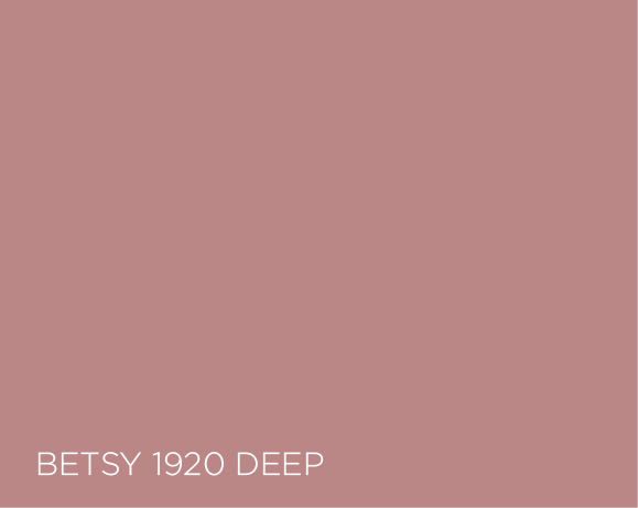
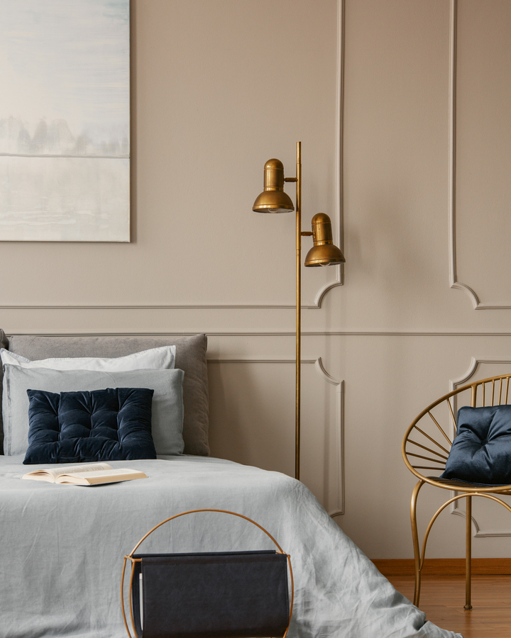
Blush colours are still prominent this year. Deeper warmer hues like Betsy 1920 Deep from the Vogue Collection lend that classic mid-century look that is re-emerging everywhere. Teaming these colours with deep rich greens like Pineneedle from the Pantone collection will prove immensely popular this year, as we couple it with brass accessories and tactile velvets.
What should homeowners consider when changing paintwork in the home?
Consider the space you have and how you use it. The practical purpose of a room can hugely influence the colour choices you make, for instance if you are repainting a bedroom you may want to feel more relaxed here rather than using a similar colour for a dining area that is much more social and vibrant.
What is your favourite interiors trend for the coming season?
I think that clients will be much more willing to break the boundaries of rooms, blurring the lines of surfaces by perhaps painting down through skirtings and onto floors or choosing your ceiling as a focal pop of colour. Given the year we have had, we have never spent so much time in our homes and keeping the trends in mind with those deep moodier colours, daring to be different I think is the way forward.

What is your colour trend of the year?
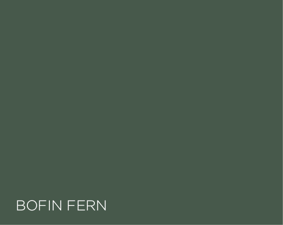
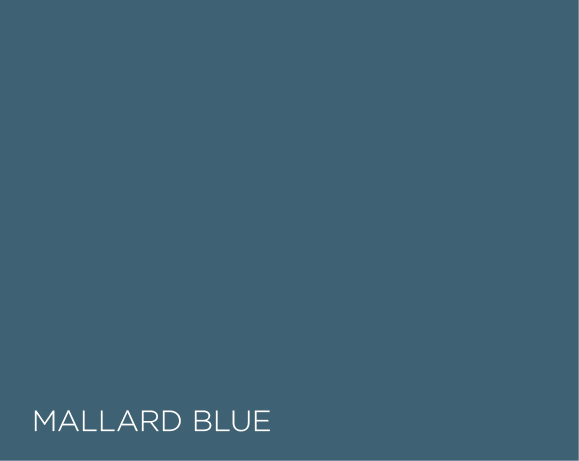
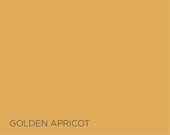
I think our colour choices are defined by a need to make our space feel safe, inviting but also with a dash of style added for good measure. We may also feel a need to incorporate colours that are evocative of a happy memory or place that we would like to remind ourselves of. My picks would be: Bofin Fern, a deep evergreen shade; Mallard Blue, an exciting deep kingfisher blue; and Golden Apricot, a rich burnt gold colour that is very uplifting.
What should homeowners be conscious of when choosing paint colours?
Assess the room’s function; whether it will be used for relaxation, work, living or is it a high traffic area like the hall. Think about the atmosphere, and work out what mood you want to convey. The aspect will all need a different choice approach too. Finally, consider your own emotional response to colours. What colours energise you?
What is your favourite interiors trend for the coming season?
An interesting development has been the move away from a one colour fits all in open plan areas, and instead creating a more eclectic feel by defining the various zones using colour. This is attributed in no small way to how our homes have had to adapt to perform so many functions. Study/work areas are going to the dark side as we mimic the library/study rooms of older homes. The dark colours are known to aid concentration and focus so there is more than aesthetics at play here.

What colour trends do you predict for 2021?
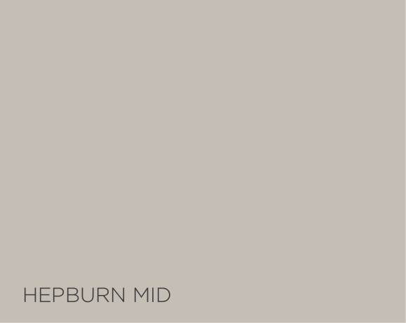
It has been a long year but it gave people a chance to focus on their homes and they want to create cosy spaces. People are going for warmer neutrals like beiges, taupe and greige. Fleetwood Bayshore Beige, Vogue Coco 1955, and the Vogue Hepburn in all the shades.
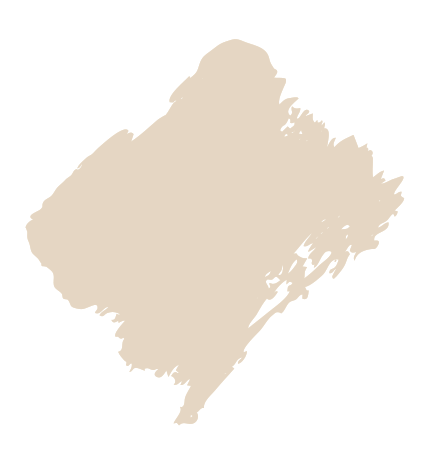
Bayshore Beige 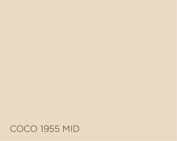
What’s the standout colour of the year to you?
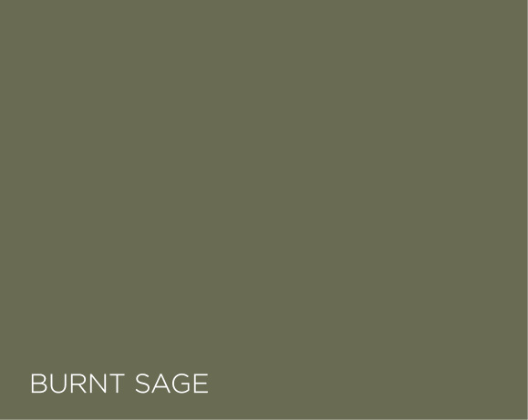
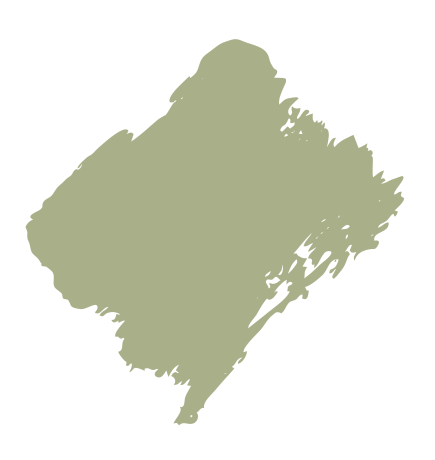
For me the colour trend for 2021 would be Vogue Burnt Sage. Greens are the new grey and work anywhere in the home. It works well with accent colours like rust, blush pinks and deep yellows. For lighter shades, try Vogue Monet Deep and Vogue Monet Dark which are kind of grey greens, and Stolen Moment is a nice fresh green.

Stolen Moment
Will how we style our homes change this season?
The rustic look and golds are going to continue, like lovely deep burnt oranges, rusts and greens. There will be a lot of textures and artwork throughout the home, and it won’t be as minimalist, there will be a warmer, homely feel.
Beyond colour
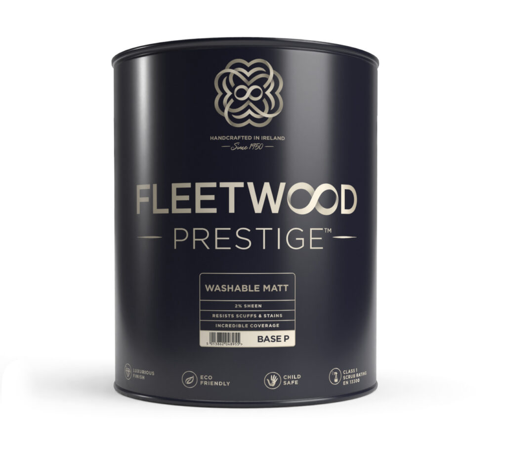
Choose Fleetwood Prestige for a luxurious cashmere appearance and durable finish, perfect to make busy homes beautiful
Fleetwood Prestigue is a strong and smooth paint that is hand-crafted in Co Cavan. This paint is hardwearing to resist scuffs and stains, with an unprecedented colour depth with rich, lightfast pigments.
Vogue and Pantone colours are exclusive to Fleetwood Prestige paint, and as part of a partnership with Pantone, Fleetwood Prestige is the official stockist capable of mixing Pantone colours into paint. Ask your local stockist for details or visit fleetwood.ie.
