Caoimhe Connolly is the owner and lead designer at Border Interiors, and also shares updates on her Co Tyrone home on @houseontheborder. Here, she shares how she created this joyful nursery for her twins, using Fleetwood Paints
Hi Caoimhe! Tell us a little a bit about yourself, and about your beautiful home.
I am an Interior Designer and a mum of four little boys – five, three and one-year-old twins – so life is very busy! We live in Co Tyrone in our home which we built on my husband’s family land. We undertook a self-build in September 2016 and moved in just before Christmas 2017. It is still very much a work- in-progress and we have continued to work on various areas since we moved in. As our four little boys arrived, our needs and priorities in the home changed and our focus in recent years has been creating spaces for them, both inside the house and outside in the garden.
How would you describe your personal taste in interior design?
I would describe my personal style as quite simple, understated and timeless. I try to create spaces that are calming, functional and easy to live in. I also try to pick colours and key pieces that will not date and always have longevity in mind for a scheme. In that sense I try to not be pulled massively into themes or trends as such but design spaces that will stand the test of time. I assess each space individually and design a concept accordingly.
A recent addition to the home is your adorable nursery. Talk us through the vision you had?
The twins’ nursery is a very special room in our house. It was always a spare room, and potentially would have become a third child’s room at some point, but we never imagined that we’d have twins in here! I wanted to create a special space that was age-appropriate for them now – they’re just one – but also one that would grow with them and their changing needs as they get older. I tried to plan for all eventualities that the space will face over the coming years: I had to consider the furniture placement of two cots now, as well as a double bed which needs to remain in the room; two beds or even bunk beds in the future; desks for the teenage years, and of course storage. Storage is absolutely key to a successful room design, especially a bedroom. I utilised a full wall for a built-in sliderobe, which we had bespoke-made in a panelled design and painted the same colour as the walls (Heron Plume) so that it would blend seamlessly into the space. In terms of the colour palette, it’s a north facing room with quite a small window in proportion to the size of the room. So, the light in the room is quite cold, and it’s quite dark. I wanted to create a bright, warm space that made the most of the light it does receive, so I carefully chose warmer-toned paint colours that weren’t too yellow or too grey.
Why did you opt for Fleetwood Paints to create your vision?
I have used Fleetwood paint for years. Almost every space in our house is a Fleetwood colour. I have always found great variety in their ranges and the quality of the paint is excellent, both in my opinion from using their products and from professional painters’ opinions too. The paints are easy to work with. Their range of accessories is also excellent and I have come to gain trust in the brand that gives me confidence in specifying their colours for various projects. I like that it is an Irish brand also and their colour matching service is one that I avail of regularly.
We love how you say: “Woodwork does not always have to be white”. You went for a colour drench option, painting the room’s door and skirting boards. Can you tell us more about this process?
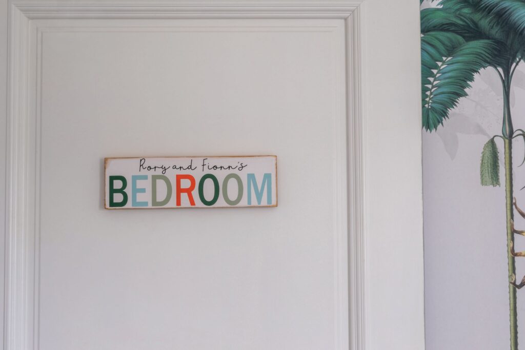
Yes! I absolutely believe that in some spaces, white woodwork simply does not make sense and for the twins’ nursery this was one of those spaces. Because the top wall colour I chose was an off-white, I felt white on the woodwork would not have sat right. I had chosen Monet Deep for the bottom half on the walls which is a mid-tone green, so it made sense to continue this colour on to the skirting boards, windowsill, architraves and the door for a seamless look. Colour drenching is such an easy way to introduce colour and to add some interest to a room. Every person who has walked into the twins’ room has commented on how the door is “not white” and it has become a real talking point. I chose a Satinwood finish for the woodwork. I gave all the woodwork a light sand and then cleaned it down with Fleetwood’s Sugar Soap which was brilliant for leaving a really clean and dust free surface for painting. I then used Fleetwood’s oil-based primer Bloxx – It to prep and prime the woodwork for painting. This dried to a matt finish and gave a really smooth, even surface for the paint. Two coats of Monet Deep in Satinwood were all that was needed to completely transform the woodwork in the room. Preparation was key for this.
You also created an impressive DIY scallop border using Fleetwood Paints. For those who’d love to recreate this, what are your top tips?
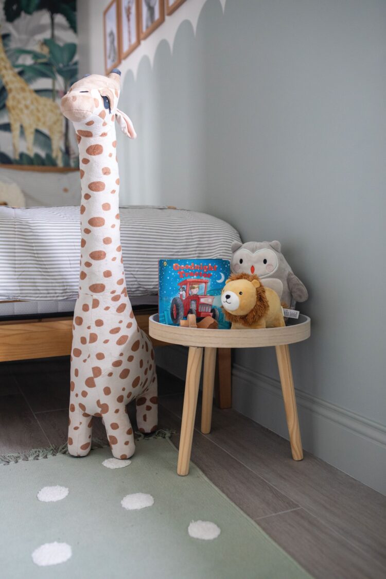
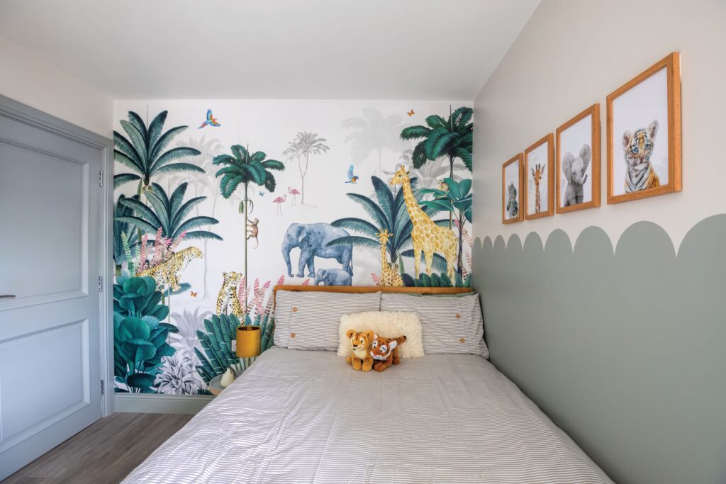
The scallop border was actually quite easy to do and I would encourage anyone to try it. I wanted to create a backdrop for the cots to sit against, and beds/other furniture in years to come. I had thought about panelling some of the walls but decided painting a border was a better option. I decided to paint a darker colour on the bottom half of the walls to create the backdrop and then decided to create a scallop border instead of a simple straight line to add a bit of interest and fun to keep it a bit more age appropriate. It’s such a lovely feature and a softer look than a harsh straight line. My top tips for creating a scallop edge border are to choose a large plate (less to paint) and to use the same width washi tape to mark the border on the walls and your plate – this makes lining up the plate on the wall easy as you just match tape to tape to draw the plate outline to create the scallop. A steady hand when painting helps!
Tell us a little more about other key features in the room, such as the wallpaper mural, framed prints and crochet lion?
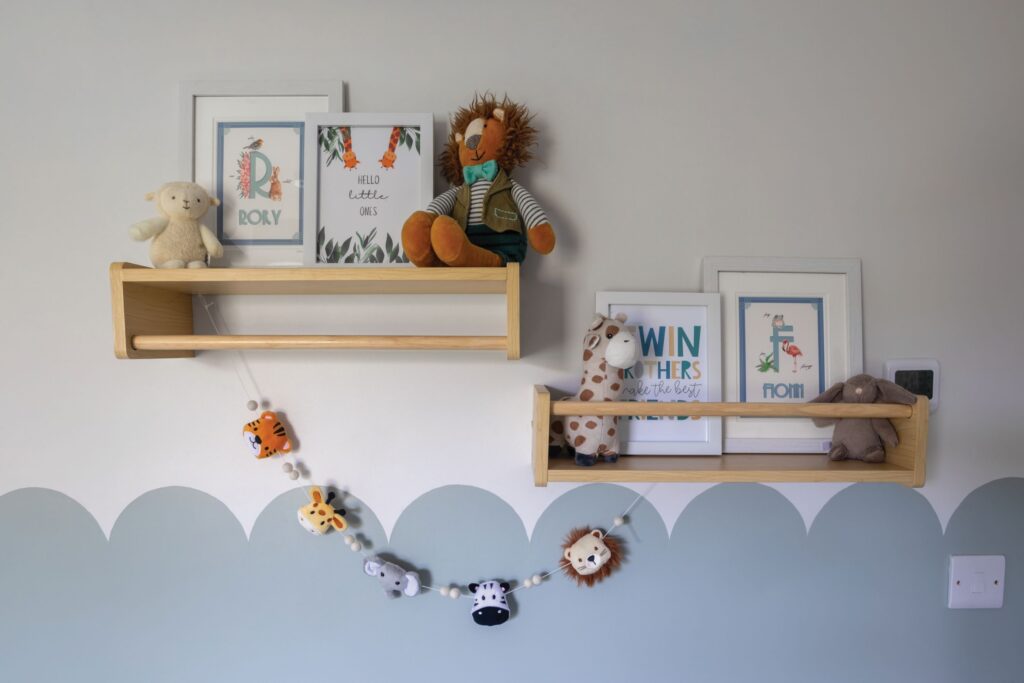
I didn’t set out to create a jungle theme in the room, but choosing the green paint shade kind of led me down that path. I knew I wanted to put a mural of some description on the back wall, opposite the wardrobe wall to balance the room out. After browsing various wallpaper murals, I decided on this gorgeous jungle print from Munks & Me. It’s fun and engaging – the babies adore looking at it and pointing out the animals. The crochet lion is such a beautiful handmade piece. I have admired Jenny Wren pieces for a long time and when the jungle theme started to emerge, it really was the perfect piece to include. The baby animal prints were actually in my older boys’ nursery so I rehoused them here and just added some new frames. They are from The Crown Prints. The various other prints are from Etsy and the ones referencing twins are very special. I think there is a nice balance of twin references and items with their own names to keep a sense of individuality, too.

When shopping for décor, where do you tend to browse?
I love to shop in independent stores as much as possible, many of whom house lots of my favourite suppliers for decor including Mindy Brownes for beautiful accessories and Scatterbox for fabulous cushions and soft furnishings. I also love Dunnes Stores and find their homewares department excellent for finding well priced pieces. I find so much inspiration on Instagram and have found some beautiful Irish and Northern Irish homeware stores there including Grove Home, The Snug Room and Osborne & Co.
You’ve used Fleetwood Paints elsewhere in your home; tell us about these?
Yes, for our hall, stairs and landing we used Warm Grey on walls and Brilliant White on Panelling and Woodwork. We used Nimbus Skyline in our master bedroom, Gothenburg in our sunroom and Gothenburg Mid in our open plan kitchen/dining and back hall. My next project is the back hall, I’d like to add some tongue and groove panelling and a coat storage wall. The walls here were recently painted in Gothenburg Mid so I’d like to keep that and paint the panelling a complementary shade – I have Hoxton Haze and Broken Shaker in mind to try. I absolutely fell in love with the Monet Deep shade used in the twins’ room so I’d like to paint the downstairs toilet in that. It’s a small room so I think a complete colour drench is on the cards – walls, door and ceiling to give a cosy, cocoon effect.


